Before your food, before your service, before your playlist, there is one moment that decides everything. The first 30 seconds at your entrance.
In Singapore, where foot traffic is fast and choices are everywhere, customers make snap decisions. They do not stand outside your restaurant analysing your concept. They feel something, then they move. Your entrance either invites them in or quietly pushes them away.
Most owners focus on signage and promotions, but the real issue is flow. Can people understand your space at a glance? Can they see where to stand, where to sit, and who will greet them? If not, they hesitate. Hesitation creates friction. Friction reduces walk-in conversion.
Try this simple test. Stand outside your restaurant during a busy period and watch ten people approach. Ask:
- Do they slow down naturally or abruptly?
- Do they look confused about where to enter?
- Do they stop because the host stand blocks the path?
- Can they see occupied tables but not available ones?
- Do they peek in and walk away within five seconds?
If the answer is yes to any of these, your entrance is leaking revenue.
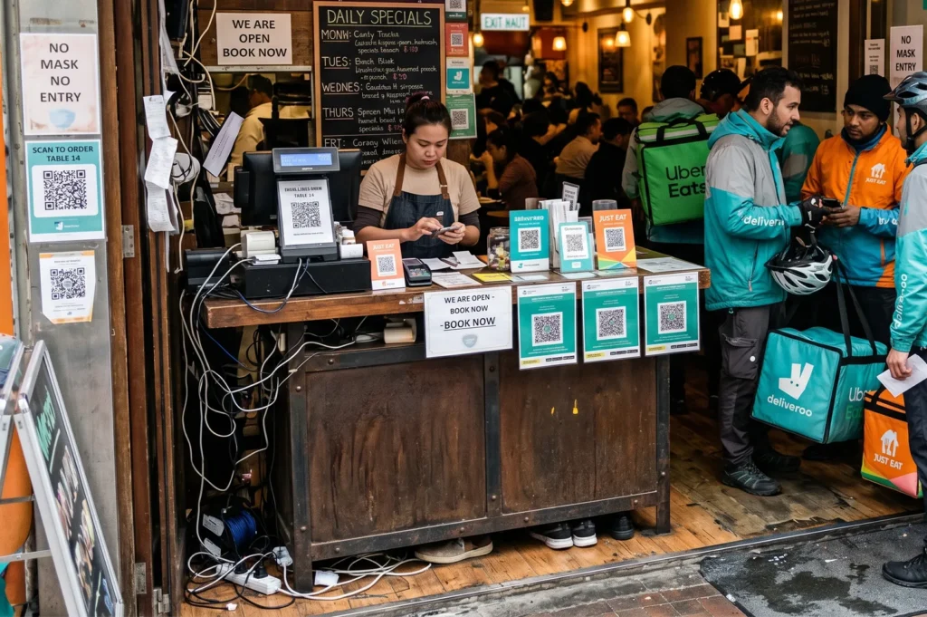
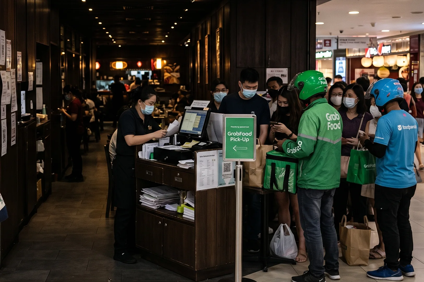
One common mistake in Singapore malls is placing too much visual clutter at the front. Promo stands, QR signs, delivery riders, waiting benches, and decorative partitions can turn the entrance into a traffic jam. What feels like “branding” to the owner feels like “chaos” to the customer. Clarity converts better than creativity at the doorway.
Shophouse restaurants face a different challenge. Narrow frontages often create a tunnel effect. If the first view inside is dark or blocked by a cashier counter, the space feels smaller than it is. A simple adjustment like moving the host point to the side, adding a visual focal point deeper inside, or improving front-zone lighting can dramatically improve entry confidence.
There is also the social comfort factor. People avoid entering spaces where they feel exposed. If your entrance forces guests to stand awkwardly in the middle of the dining room while waiting, they will choose somewhere else next time. A well-designed waiting pocket, even a small one, reduces anxiety and improves first impressions.
Do not forget service flow. If your entrance overlaps with takeaway pickup, your dine-in guests start their experience in a queue. That is the wrong emotional tone. Separate paths for dine-in and delivery can improve both operations and perception.
In many successful Singapore restaurants, the entrance is treated like a stage transition. Outside is noisy, bright, and fast. Inside is controlled, welcoming, and intentional. The design gently shifts people from street mode to dining mode. This is not about expensive materials. It is about sequencing.
If you want to improve your entrance, start with these priorities:
- Clear line of sight to seating or host
- No physical obstacles in the first three steps
- Strong visual anchor inside the space
- Comfortable waiting zone
- Distinct path for takeaway and delivery traffic
For broader guidance on universal design and accessibility in public spaces, including entry and circulation principles, refer to Singapore’s BCA Universal Design Guidelines.
Your entrance is not a doorway. It is a conversion tool. If people are not walking in, your menu is not the first problem to solve. Fix the first 30 seconds, and the rest of your customer journey gets easier.Learn how in: Restaurant Entrance Flow Design Seamless Transitions