Why do some newly renovated restaurants feel different from what their photos promise?
Over the past decade, restaurant renovations have evolved alongside visual culture. Before renovation plans are ever drawn, many restaurant owners and designers find themselves influenced by the way spaces appear online. Mood boards are assembled from Instagram feeds and portfolio shots. Renovation concepts are sketched with reference images downloaded from trend galleries. Expectations are formed around curated photos rather than lived experiences.
This shift has quietly changed how renovated restaurants are designed and evaluated, often prioritising how a space photographs over how it feels. The result is a subtle but noticeable divide between what diners see on their screens and what they encounter in real life.
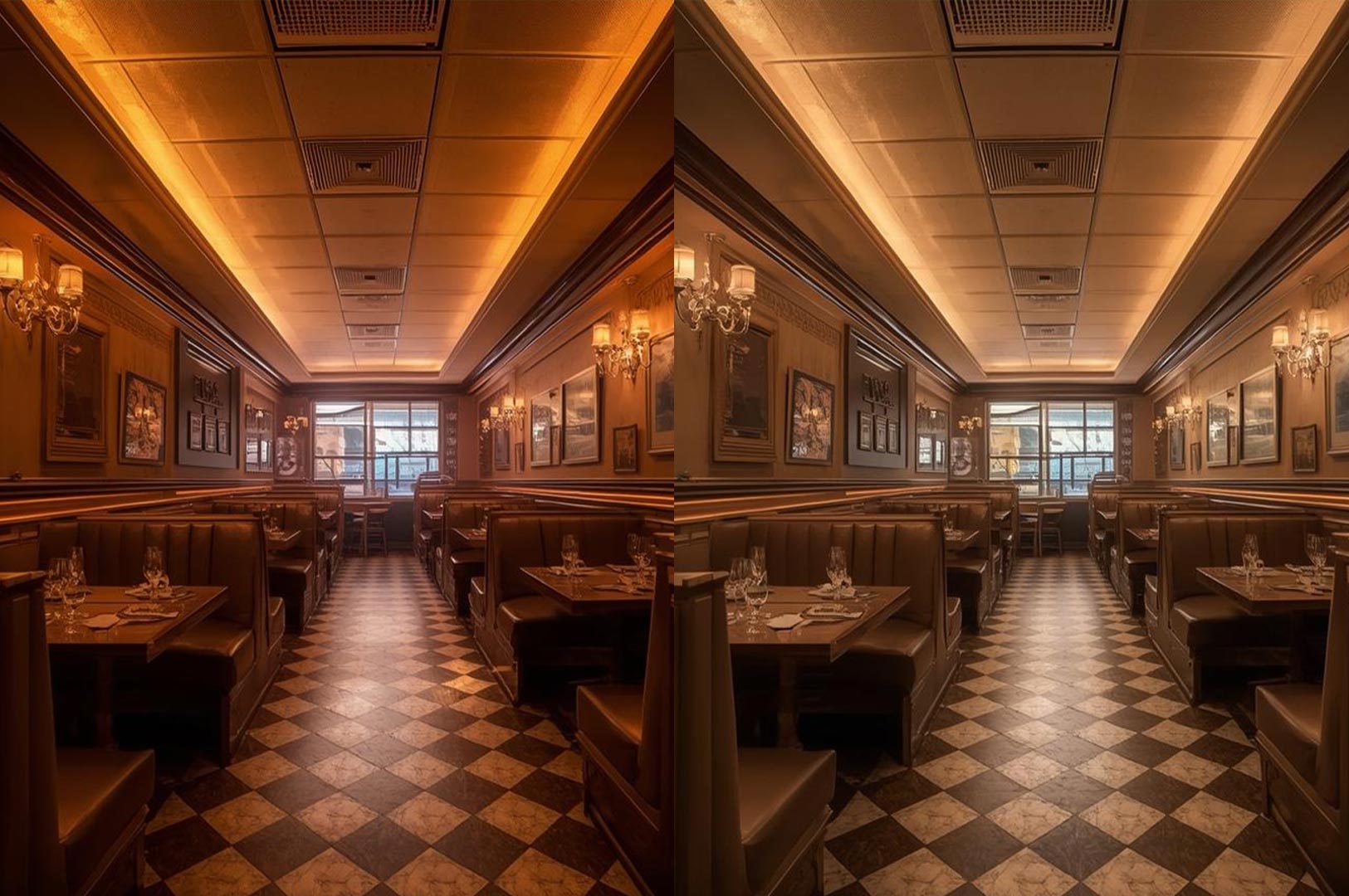
Photography is not a neutral medium. A well-shot image can flatten depth, soften imperfections, and amplify atmosphere in ways that do not always reflect physical realities. Wide-angle lenses make narrow spaces appear generous. Strategic lighting and composition can make surfaces glow and colours appear more refined. These effects are powerful for showcasing design, but they also shape expectations long before a chair is placed or a light is installed.
Lighting, in particular, is one of the elements most affected by this divide. Renovated restaurants often look warm and inviting in photographs, even when the actual lighting during operation feels harsh or uneven. Mixed lighting conditions, a challenge common in hawker centres and open dining environments, can be especially difficult to capture accurately. Balancing fluorescent tubes, ambient daylight, and artificial warm light becomes a technical exercise in photography that most viewers never see. Discussions around these challenges, such as the breakdown of hawker centre photography camera settings by SG Nomad Photographer, highlight how much adjustment is required to represent food environments accurately.
This discrepancy matters in restaurant renovation because many owners use photographs from other spaces as reference points for their own projects. If a reference image looks spacious and inviting due to lens choice and careful exposure, there is a risk that designers and stakeholders carry forward an idealised perception of scale. When the space is built, the lighting, proportions, and material behaviour may not translate as anticipated, leaving a gap between expectation and experience.Spatial perception is another area where this tension becomes apparent. Renovation photographs often prioritise clean sightlines and symmetry. They invite viewers to linger visually rather than understand the demands of service. Wide lenses exaggerate depth, making circulation paths seem more generous than they truly are. During peak hours, when staff movement and customer flow overlap, these spatial constraints quickly reveal themselves. What appeared comfortable online may feel tight and inefficient in practice.
Material selection also plays a role in how spaces are perceived online versus in person. Certain finishes, such as matte plaster, dark timber, or textured stone, photograph beautifully under controlled lighting. On site, those same materials may absorb light, increase visual weight, or amplify sound. Acoustic discomfort, glare at certain hours, and wear over time are rarely communicated through renovation imagery, even though they shape daily experience far more than visual impact alone.
Operational realities are perhaps the most consistently absent element in renovation photography. Images rarely show service congestion, prep overflow, or staff navigating tight corners. Dining rooms are staged and empty, surfaces are pristine, and layouts appear frictionless. When renovation decisions are made using these images as primary references, workflow challenges can be underestimated or overlooked entirely.
This is not to suggest that photography should be dismissed in the renovation process. Visual documentation remains essential for conveying design intent, mood, and material relationships. Photography helps align stakeholders and communicate ideas efficiently. The issue arises when images are treated as complete representations rather than selective interpretations.
Some of the most successful restaurant renovations are those that attract less online attention but perform exceptionally well in daily operation. These spaces may not rely on dramatic lighting or striking angles. Instead, they prioritise circulation, comfort, and adaptability. They feel intuitive during service and welcoming across different times of day. Their success becomes apparent through use rather than through imagery.
As restaurant renovation continues to evolve in parallel with visual culture, the gap between representation and reality will persist. What can change is how renovation imagery is interpreted. When photographs are viewed as one layer of understanding, alongside site visits, mock-ups, and operational testing, design decisions become more grounded and resilient.
In the end, the most enduring renovations are rarely those that look perfect in a photograph. They are the spaces that hold up under daily service, accommodate changing conditions, and continue to feel right long after the camera has left the room.