I have learned to judge a cafe within the first few seconds of stepping inside. Before the coffee, before the food arrives, the space tells you whether the owners truly understand hospitality. Punch Cafe Singapore is one of those places where the design speaks clearly, and what it says is welcoming.
In this piece, I want to examine Punch through a designer’s eyes. We will look at how its exterior presence, interior aesthetic, layout, and menu integration work together to draw people in and keep them returning. This is a supporting study for our larger guide on the top cafe spots in Singapore, and it offers grounded lessons for any cafe owner planning a renovation.
Punch and Its Street Presence at 32 North Canal
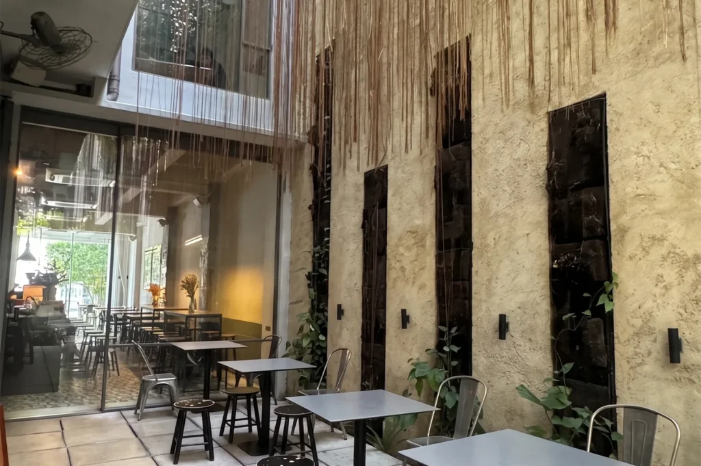
Tucked at 32 North Canal Road, within easy reach of Raffles Place, Punch Cafe Singapore understands the value of a strong first impression. The exterior uses large, inviting windows that let passers-by see straight into the room, which is one of the simplest and most effective design tools a cafe can use.
When you walk along the canal, the storefront feels open rather than guarded. Clear signage and an easy entry cue tell you exactly where to go, and the glimpse of greenery and natural light inside acts as a quiet invitation. That transparency lowers the barrier to entry, especially for the busy office crowd nearby.
Why it matters: in a competitive area like Raffles Place, customers often decide whether to step in before they read a single menu item. Punch wins that decision through openness and clarity.
Interior Aesthetic and the Vibe That Defines Punch Cafe
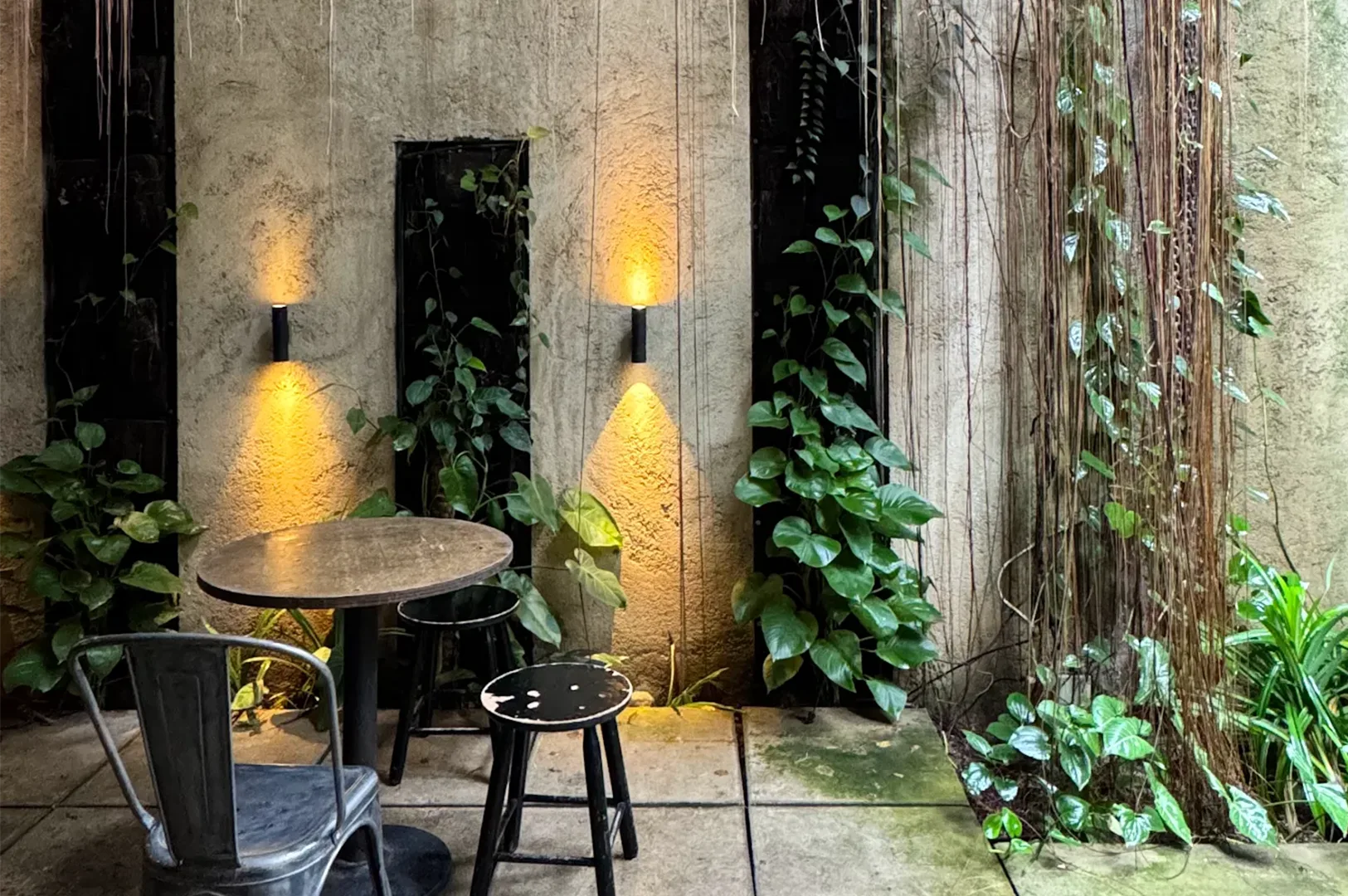
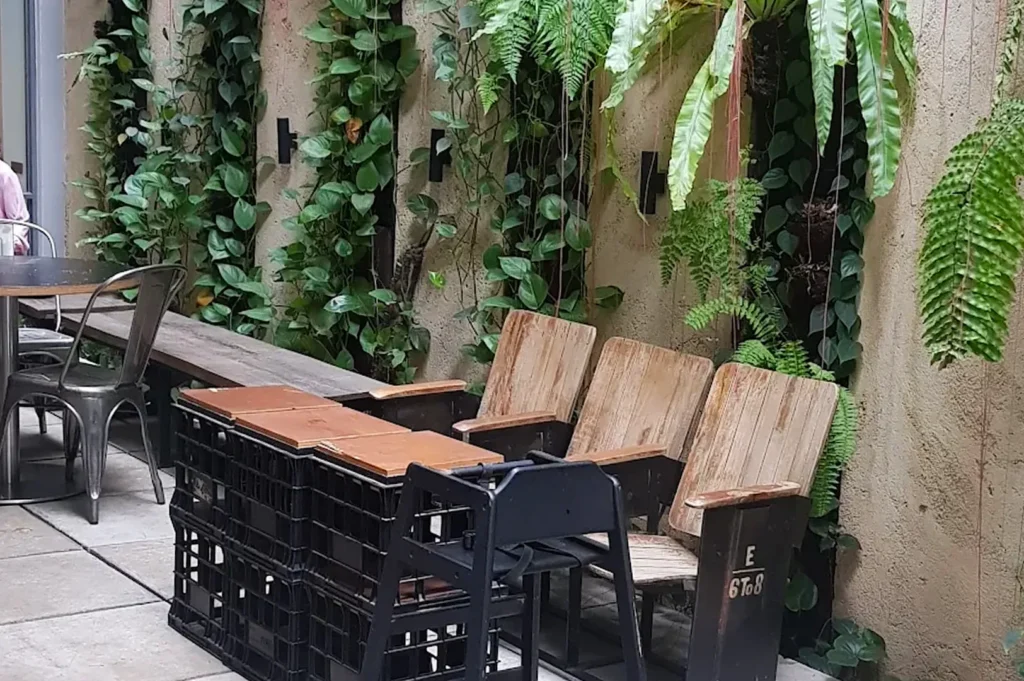
Inside, the café strikes a calm balance between modern function and earthy warmth. The colour palette leans toward natural, grounded tones, softened by greenery and gentle lighting that flatters both the room and the food. Nothing shouts for attention, and that restraint is precisely the point.
The material choices feel considered. Timber surfaces, simple finishes, and thoughtful decorative details create a cohesive vibe without clutter. As a designer, I appreciate how the space avoids trend-chasing and instead commits to a relaxed, pleasant atmosphere that suits long visits.
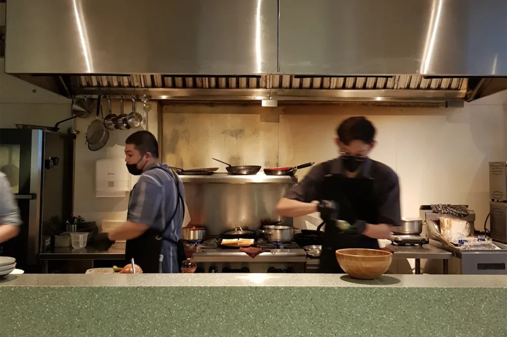
The open kitchen sits as a natural focal point. Watching the team prepare each drink and plate adds a quiet sense of theatre, and it reassures customers about freshness. This visibility turns daily operations into part of the experience rather than something hidden away.
Layout and Customer Flow Inside Punch Cafe Singapore
Good circulation is invisible when it works. At Punch, the layout guides you naturally from the entrance toward the counter, with enough room to pause, order, and move without disturbing seated guests. The flow feels intuitive, even during a busy lunch service.
The seating mix is one of its smarter design decisions. Smaller tables suit solo diners and remote workers, while larger arrangements welcome groups and familiar faces catching up over coffee. This variety lets the cafe serve different needs within a compact footprint near the canal.
Why it matters: when a space offers both comfort and clear movement, customers linger longer and feel less rushed. That ease is what separates a quick takeaway stop from a spot people genuinely want to settle into for breakfast or an afternoon tea.
How the Punch Singapore Menu Complements the Space
A thoughtful renovation should support the menu, not compete with it. The Punch Singapore menu feels at home within the relaxed, earthy setting, and the plating shares the same understated confidence as the interior. Food and space speak one visual language here.
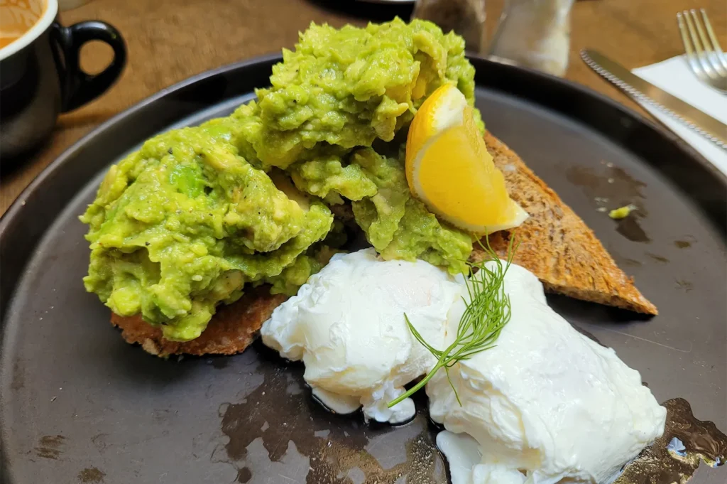
Brunch favourites such as avocado toast, poached eggs, and french toast arrive looking fresh and unfussy, suiting the natural palette of the room. Lighter options built around greens, spinach, and a vitamin boost reflect the cafe’s clean, grounded character. Even the drinks, from coffee to a refreshing pineapple slushie, fit the easy daytime mood.
The presentation rewards attention to detail. A grilled seabass plated with mango salsa, sandwiches served simply, and toast paired with jam, nutella, or custard all feel intentional. This coherence between the menu and the design is no accident, and it quietly raises customer expectations in the best way.
Earl Grey Pancakes and the Photogenic Side of Punch
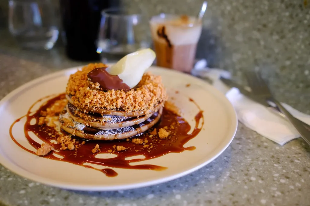
Some dishes simply belong to a room. The earl grey pancakes are a good example, their soft tones and gentle plating catching the natural light against the timber surfaces. They photograph beautifully, and that visual harmony between food and setting helps the cafe travel further online.
Pancakes in general suit Punch’s relaxed personality, offering comfort without heaviness. When paired with a pot of tea or a simple coffee, they become the kind of order customers return for. The design frames these moments without ever forcing them.
Why it matters: photogenic corners are not vanity. When food and space agree visually, customers share their visit naturally, which extends a neighbourhood cafe’s reach far beyond the canal.
When Delicious Food Meets a Well-Designed Room
I always notice how a space handles the gap between ordering and eating. At Punch, the comfortable seating and pleasant atmosphere make that wait feel easy rather than tedious. Delicious food matters more when the room around it supports the experience.
Real customer observations tend to echo this. Visitors often mention the friendly, polite staff, the calm vibe, and how the greenery makes the place feel grounded and fresh. These are design outcomes as much as service outcomes, and the two reinforce each other.
Prices sit at a level customers find fair for the quality and the setting. That balance between value, comfort, and presentation is exactly what encourages repeat visits in a daytime crowd that has plenty of choices nearby.
How Food Arrives and Why Presentation Shapes Behaviour
The moment food arrives at the table is a quiet test of a cafe’s standards. At Punch, plates reach guests looking fresh and considered, and that consistency builds trust over time. Customers begin to expect care, and the kitchen delivers it.
This is where design and operations meet. The open kitchen, the natural light, and the uncluttered tables all work together so that each dish looks its best on arrival. Good lighting in particular does more for perceived freshness than many owners realise.
Why it matters: when presentation aligns with the room, customers perceive higher quality before tasting anything. That perception shapes satisfaction, reviews, and the decision to return.
Great Service and the Return Appeal of Punch Cafe
Design sets the stage, but people complete the experience. Reviewers frequently describe a great experience at Punch, pointing to attentive, friendly staff who explain the menu and check in without hovering. Great service feels natural within a space that already encourages calm.
The cafe also supports different reasons to visit. Some come for a quiet breakfast, others for a working lunch, and many simply for coffee and conversation. A dog friendly attitude and a welcoming team make it feel like a genuine neighbourhood spot rather than a transactional stop.
Reliable hours and a consistent atmosphere matter too. Customers return for places that feel familiar and comfortable, and Punch delivers that steadiness through both its design and its hospitality.
Renovation Lessons for Cafe Owners
For owners planning their own projects, Punch offers several clear takeaways. First, invest in your street presence. Large windows, clear signage, and a visible interior lower the barrier for walk-ins, especially in a busy district near Raffles Place.
Second, commit to one cohesive aesthetic. The earthy palette, greenery, and natural materials work because they agree with one another rather than chasing every trend. Third, plan seating for variety, so solo workers, couples, and groups all feel they have a place.
Finally, make sure your menu and your space share a visual language. When plating, materials, and lighting align, the whole experience feels intentional. That coherence supports both customer satisfaction and steady business performance.
Punch Cafe: Where Thoughtful Design Creates a Welcoming Haven
Punch Cafe succeeds because its design was led by clarity about the customer experience. The inviting exterior draws people in, the warm interior keeps them comfortable, and the menu integration ties everything together. None of it relies on hype, and that restraint is its quiet strength.
Punch Cafe demonstrates that thoughtful cafe design can make a neighbourhood space memorable and inviting. For more examples, visit restaurantrenovations.com.sg.